UI for a payments app.
Case Study, Jan. 2020
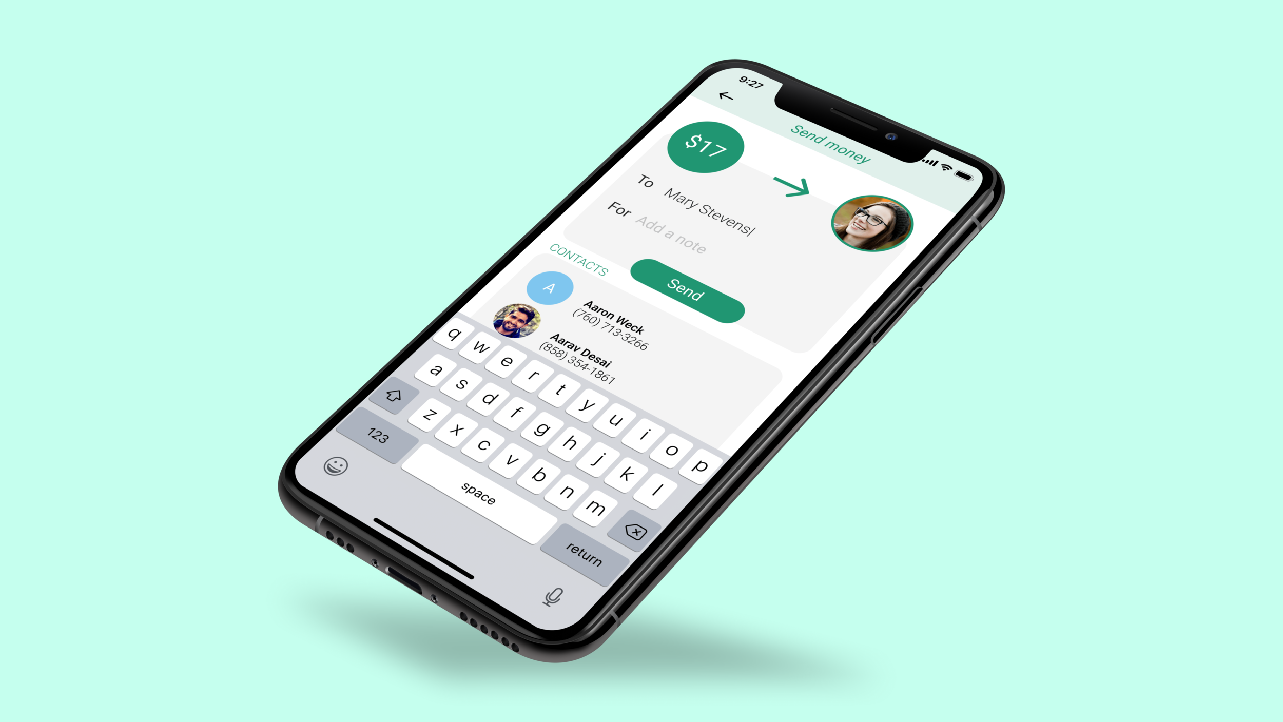
As an avid Venmo user, I became very familiar with the pain points of the app and decided to try my hand at solving them. I branded my own version of a payments app named “Spend” and designed its user interface with one overarching goal in mind: to avoid all of Venmo’s downfalls.

Venmo is a digital wallet platform where people can transfer funds easily. The app has its shortcomings as well as its strengths, and in the process of redesigning it’s UI I was able to more clearly understand both. Below are a few of the pain points I identified and tried to address through my updated design:
Lack of easy access to past transactions: through the Venmo app, there is no easy way for users to see a comprehensive list of the money coming in and the money coming out of their account. The past transactions tab on the app is not labeled clearly and thus, hard to find. In addition, monthly statements are sent through email or available on the desktop app however, most users use the Venmo mobile app so they are unaware of this important feature.
Lack of separation between incoming and outgoing spending: As a user, I’d like to be able to see 2 separate lists of just my outgoing transactions and just my incoming transactions. Venmo does not offer this feature.
A confusing main social feed: One of Venmo’s defining qualities is its Main Social Feed - the newsfeed of other user’s public transactions. While this tab is sometimes interesting to scroll through, it can feel lengthy, confusing, and generally unnecessary to the purpose of the app.